CSS Responsive Modal Images
Responsive Modal Image Gallery
A modal image gives a user the ability to display a larger version of an image, without navigating away from the current page. When a user clicks on a modal image, it shows a popup window that appears on top of the main content of the webpage, often with a semi-transparent background. The modal must be closed by the user, typically with a "close" button or an "X" sign in top-right corner.
This example demonstrates how to use HTML, CSS and JavaScript together, to create a responsive modal image gallery.
We use CSS to create a modal window (dialog box), and hide it by default.
Then, we use a JavaScript to show the modal window with the correct image inside, when a user clicks on the image:


×
×
×
×
Example
<html>
<head>
<meta name="viewport" content="width=device-width,
initial-scale=1.0">
<style>
* {
margin: 0;
padding: 0;
box-sizing: border-box;
}
h1 {
text-align: center;
padding:
20px;
}
.gallery {
display: flex;
flex-wrap: wrap;
justify-content: flex-start;
padding: 0 15px;
}
.gallery-item {
position: relative;
width: calc(25% - 20px);
height: auto;
margin:
10px;
cursor: pointer;
transition: transform 0.5s ease;
}
.gallery-item:hover {
transform: scale(1.1);
}
/* The Modal
(background) */
.modal {
display: none;
position: fixed;
z-index:
1000;
left: 0;
top: 0;
width: 100%;
height: 100%;
background-color: rgba(0, 0, 0, 0.8);
align-items: center;
justify-content: center;
transition: opacity 0.5s ease;
}
/*
Modal content (image) */
.modal-content {
position: relative;
width:
90%;
height: auto;
max-width: 90%;
max-height: 90%;
border-radius:
5px;
overflow: hidden;
animation: zoomIn 0.5s;
}
@keyframes
zoomIn {
from {transform: scale(0.6);}
to {transform: scale(1);}
}
.modal.show {
display: flex;
opacity: 1;
}
/* Close button
*/
.close {
position: absolute;
top: 10px;
right: 15px;
color:
#ffffff;
font-size: 35px;
font-weight: bold;
cursor: pointer;
transition: transform 0.3s;
}
/* Caption of modal image */
.caption {
position: absolute;
bottom: 15px;
width: 100%;
text-align: center;
color: #ffffff;
font-size: 24px;
}
@media
screen and (max-width: 768px) {
.gallery-item {
width: calc(50% - 20px);
}
}
@media screen and (max-width: 480px) {
.gallery-item {
width: calc(100% - 20px);
}
}
</style>
</head>
<body>
<h1>Responsive Modal Images</h1>
<div class="gallery">
<img
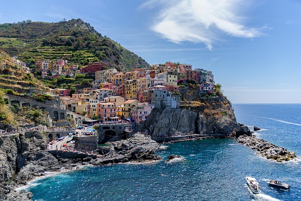
src="img_5terre.jpg" alt="Cinque Terre" class="gallery-item"
onclick="openModal('modal1', 'Cinque Terre')">
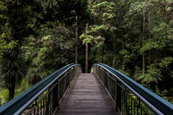
<img src="img_forest.jpg" alt="Forest" class="gallery-item"
onclick="openModal('modal2', 'Forest')">
<img
src="img_lights.jpg" alt="Northern Lights" class="gallery-item"
onclick="openModal('modal3', 'Nothern Lights')">
<img src="img_mountains.jpg" alt="Mountains" class="gallery-item"
onclick="openModal('modal4', 'Mountains')">
</div>
<div id="modal1" class="modal">
<span class="close"
onclick="closeModal('modal1')">×</span>
<img src="img_5terre.jpg"
alt="Cinque Terre" class="modal-content">
<div
class="caption"></div>
</div>
<div id="modal2" class="modal">
<span class="close" onclick="closeModal('modal2')">×</span>
<img
src="img_forest.jpg" alt="Forest" class="modal-content">
<div class="caption"></div>
</div>
<div id="modal3"
class="modal">
<span class="close"
onclick="closeModal('modal3')">×</span>
<img src="img_lights.jpg"
alt="Northern Lights" class="modal-content">
<div
class="caption"></div>
</div>
<div id="modal4" class="modal">
<span class="close" onclick="closeModal('modal4')">×</span>
<img
src="img_mountains.jpg" alt="Mountains" class="modal-content">
<div class="caption"></div>
</div>
<script>
function openModal(modalId, caption) {
let modal =
document.getElementById(modalId);
modal.style.display = "flex";
modal.classList.add("show");
let message = modal.querySelector(".caption");
message.innerText = caption;
}
function closeModal(modalId) {
let
modal = document.getElementById(modalId);
modal.classList.remove("show");
setTimeout(function () {
modal.style.display = "none";
modal.querySelector(".caption").innerText = "";
}, 300);
}
</script>
</body>
</html>
Try it Yourself »
