Responsive Web Design - The Viewport
Setting The Viewport
The viewport is the user's visible area of a web page.
The viewport varies with the device (will be a lot smaller on a mobile phone than on a computer screen).
You should include the following <meta> element in
the <head> section of all your web pages:
<meta name="viewport" content="width=device-width, initial-scale=1.0">
This gives the browser instructions on how to control the page's dimensions and scaling.
The width=device-width part sets the width of the page to follow the screen-width of the device (which will vary depending on the device).
The initial-scale=1.0 part sets the initial zoom level when the page is first loaded by the browser.
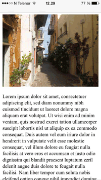
Here is an example of a web page without the viewport meta tag, and the same web page with the viewport meta tag:

Tip: If you are browsing this page with a phone or a tablet, you can click on the two links above to see the difference.
Size Content to The Viewport
Users are used to scroll websites vertically on both desktop and mobile devices - but not horizontally!
So, if the user is forced to scroll horizontally, or zoom out, to see the whole web page it results in a poor user experience.
Some additional rules to follow:
1. Do NOT use large fixed-width elements - For example, if an image has a width wider than the viewport, it causes the viewport to scroll horizontally. Remember to adjust this content to fit within the width of the viewport.
2. Do NOT let the content rely on a particular width to render well - Since screen dimensions vary widely between devices, content should not rely on a particular viewport width to render well.
3. Use CSS media queries to apply different styling for small and large screens - Setting large absolute CSS widths for page elements will cause the elements to be too wide for smaller devices. Instead, consider using relative width values, such as width: 100%. Also, be careful of using large absolute positioning values. It may cause the element to fall outside the viewport on small devices.
