CSS Horizontal Navigation Bar
CSS Horizontal Navigation Bar
In a horizontal navigation bar, the navigation links are stacked horizontally (next to each other), and is typically aligned on the top of a webpage.
The basics of a horizontal navigation bar is an unordered list (<ul>), with list items (<li>), each holding a link (<a>), as shown in the Navbar Intro page.
It is also common to add a <nav> element around the <ul> element, that will serve as a container for your navigation bar.
Horizontal Navbar Using Float
One way of creating a horizontal navigation bar is to add the float
property to the <li>
elements.
Here we create a basic horizontal navigation bar with a dark background color and change the background color of the links when the user moves the mouse over them:
Example
Horizontal navbar with float:
ul {
list-style-type: none;
margin: 0;
padding: 0;
overflow:
  hidden;
background-color: #333333;
}
ul li {
float: left;
}
ul li a {
display: block;
color: white;
text-align: center;
padding: 14px 16px;
text-decoration: none;
}
ul li a:hover {
background-color:
#111111;
}
Try it Yourself »
Example explained:
overflow: hidden;- Prevents list items from going outside of the listbackground-color: #333333;- Adds a black background-color to the <ul> elementfloat: left;- Makes <li> elements float next to each otherdisplay: block;- Allows us to specify padding, height, width, and margins to <a>padding: 14px 16px;- Add some padding between each <a> elementtext-decoration: none;- Removes underline from the links
Horizontal Navbar Using Flex
A more modern way of creating a horizontal navigation bar, is to use CSS flexbox.
The following example creates an equal-looking horizontal navbar as above, but with flexbox:
Example
Horizontal navbar with flex:
ul {
list-style-type: none;
margin: 0;
padding:
0;
background-color: #333333;
display: flex;
}
ul li a
{
display: block;
color: white;
padding: 14px
16px;
text-decoration: none;
}
ul li a:hover {
background-color:
#111111;
}
Try it Yourself »
The solution here are display: flex;. This
creates a flex context and by default the items are shown from left to right.
And just by adding one line to the ul block: justify-content:
center;, you will have a horizontally centered navbar:
Example
Horizontal centered navbar with flex:
ul {
list-style-type: none;
margin: 0;
padding:
0;
background-color: #333333;
display: flex;
justify-content:
center;
}
Try it Yourself »
Active State
Here, we add an "active" class to highlight the link corresponding to the current page to let the user know which page/section he/she is on:
Gray Horizontal Navbar
Here is an example of a gray horizontal navigation bar with a thin, gray border:
Example
ul {
list-style-type: none;
margin: 0;
padding:
0;
display: flex;
border: 1px solid #e7e7e7;
background-color: #f3f3f3;
}
Try it Yourself »
Right-align Last Link
You can right-align one or more links by floating the list items to the right (float: right;):
Example
<ul>
<li><a href="#home" class="active">Home</a></li>
<li><a href="#news">News</a></li>
<li><a href="#contact">Contact</a></li>
<li style="float:right"><a href="#about">About</a></li>
</ul>
Try it Yourself »
Border Dividers
Add the border-right property to <li>
elements (to all <li>s, except the last), to create link dividers:
Example
/* Add a lightgray right border to all list items, except the last */
ul li {
float: left;
border-right: 1px solid #bbbbbb;
}
ul
li:last-child {
border-right: none;
}
Try it Yourself »
Fixed Navigation Bar
You can make the navigation bar to stay fixed at the top or at the bottom of
a page, by using the
position property along with
top or
bottom:
Note: Fixed position might not work properly on mobile devices.
Sticky Navigation Bar
Add position: sticky; to <ul> to create a sticky navbar.
An element with position: sticky; toggles between
a relative and fixed
position, depending on the scroll position.
A sticky element is positioned relative until a certain scroll position is reached - then it "sticks" in that place (like position: fixed).
Note: You must specify at least one of the top, right, bottom or left
properties, for
sticky positioning to work.
Dropdown Menu in Navigation Bar
Here we create a dropdown menu for one of the menu links:
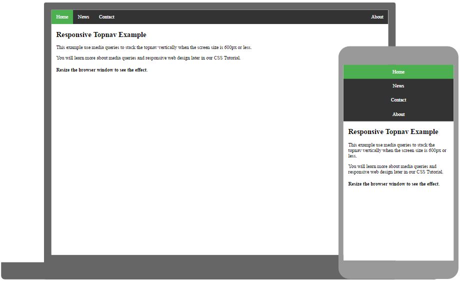
Responsive Navbar
Ever heard about W3Schools Spaces? Here you can create your website from scratch or use a template.
Get started for free ❯* no credit card required
