Accessibility Screen Readers
Why
Screen readers are necessary for blind people, important for partially-sighted users and helpful for people with reading disorders.
What
It is hard to teach about web accessibility without talking about screen readers. Screen readers has become for web accessibility what wheel chairs is for accessibility. Even though it is a myth that accessibility is just for blind or partially-sighted users, screen reader support is a mandatory topic.
If you have done everything you have learned in this course, your site should probably work well in screen readers. That does not necessarily mean that all blind users are able to use it.
As the name implies, a screen reader is a tool that reads your screen. Necessary for blind people, important for partially-sighted users and helpful for people with reading disorders.
Most common screen readers
You will learn the name of four different screen readers.
Mobile
For mobile devices, Apple has the biggest share of screen reader users. The screen reader VoiceOver is built in on iOS. The second most popular is TalkBack for Android, also built in on all Android devices.
Making sure your site works well with these two is a good starting point. Before we proceed, read these articles:
Desktop and laptop
For desktop and laptop computers, there is two screen readers you should be aware of – NVDA and JAWS. If you have to choose one for testing, go for NVDA. It is free and its popularity is growing. Both are only available for Windows.
How
You will to set the language, and we will test two websites – Toyota and Hyundai.
Language
For the screen reader to speak the correct language, it needs to know what language your content is. This is done with the lang attribute in the <html> element. The following example specifies English as the language:
<!DOCTYPE html>
<html lang="en">
- Check the source code of the english Wikipedia article about Dyslexia.
- Click the language Bahasa Indonesia.
- Check the source code again.
The lang attribute changed from lang="en" to lang="id". Good for screen readers and good for search engines.
Language of parts
Sometimes parts of your content is in another language. To make screen readers change their language in the middle of the page, we use the same lang attribute. Check the source code of the link to Bahasa Indonesia on the english page about Dyslexia:
<a href="https://id.wikipedia.org/wiki/Disleksia" lang="id" hreflang="id">Bahasa Indonesia</a>
Now the screen reader understands that the words "Bahasa Indonesia" should be read in the language Bahasa Indonesia, not English. It also understand that the target page is in Bahasa Indonesian because of the hreflang attribute.
Screen reader testing
Let's scratch the surface of screen reader testing. In this course, we will not dig deep. Screen readers is a big topic. Use your phone to follow these two examples. You might not hear exactly what's written here, there are many factors that affect the screen reader output.
Toyota

- Open toyota.com in your browser and turn on TalkBack or VoiceOver. On Android, use Chrome. On iOS, use Safari.
- Swipe from left to right, to reach the first element on the front page. You will hear something like "Skip to main content …". Good, a skip link!
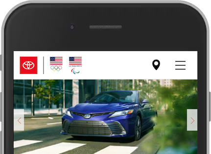
- Swipe to the next element. "Toyota link main-navigation-bar …". A bit confusing? "Toyota" comes from the SVG with the
<title>Toyota</title>. - Swipe to the next element. "Button". What does this button do? We have no idea.
- Next. "Button". What?
- Next. "Button". Let us give up.
After hearing the logo, you probably got lost. Three buttons without accessible names. As you learned in the page Role, Name and Value, all elements must have an accessible name.
How to improve this experience
- Better label on navigation landmark. As you have learned in Landmarks, you must use
aria-labelif you have more than one of each landmark. Toyota has more than one<nav>, so they have usedaria-labellike they should. However, the value of the attribute should be written for humans without hyphens.<nav aria-label="main">would be better. - Better link name on logo. As you learned in Link Text, a link text should explain clearly what information the reader will get by clicking on that link. This can be improved by using
aria-label="Toyota front page"on the<a>. - The first "Button" is a <input type="button"> without an accessible name. It opens a modal asking for a zip code to find Toyota dealers nearby. This can be fixed by using
aria-label="Enter zip code to find a dealer nearby"on the<input>. - The second "Button" is related to the zip code button. It has a geolocation icon. From an accessibility point of view, these two elements should be merged into one.
- The third "Button" is the hamburger icon. A
aria-label="Open menu"would make this accessible.
These small changes would improve the Toyota site, not fix it. Using components like modals and menus requires other considerations as well. This course will not go into details about custom components. If you want to learn more about patterns like these, please visit WAI-ARIA Authoring Practices 1.1 to read about menu button, modal and carousel.
Hyundai

- Open Hyundai Worldwide turn on your screen reader.
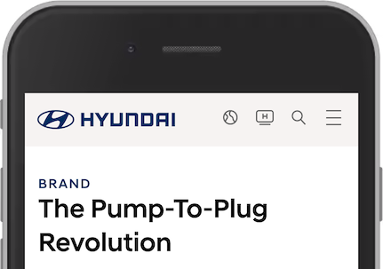
- Swipe from left to right, to reach the first element on the front page. "Go to menu". Good, a skip link!
- Swipe to the next element. "Hyundai World Wide". Probably the page we are on.
- Next. "Hyundai, link image". Probably the logo.
- Next. "Go to global distributors page, button". We understand this, but is it a button?
- Next. "Go to channel Hyundai page, link". Understandable.
- Next. "Search, button". Perfect.
- Next. "Menu, button". Great.
Overall, the top part of the page is accessible for screen reader users. The following tips are small improvements.
How to improve this experience
- The "Hyundai World Wide" is a
<span>for screen readers only. It is visually hidden. The intentions is to tell the user the title of the current page. This is redundant because of the<title>element and can be removed. - Better alt text on logo. Include the intention of the link:
alt="Hyundai World Wide front page". - Strip down the accessible names on links and buttons. Remove "Go to" and "page". Global distributors is enough.
- Use
<a>instead of<button>on the Global distributors link, as we learned in Buttons and Links.
Now you have learned the basics of a screen reader. Feel free to explore other accessibility options built in your mobile device. Try to operate your phone with your face, using switch controls.

