Accessibility Descriptive Texts for Images
Why
From the previous page, you learned that meaningful images need descriptive texts. In this page you will learn what to write. The alternative text for an image is for users that for some reason cannot view it. The reason can be a slow connection, an error with the image file, or if the user uses a screen reader.
What
The value of the alt attribute should describe the image, or even better the intention of the image.
How
You will learn how to add descriptive text for non-interactive images, stand-alone icons and logos.
Non-interactive images
Imagine you were to explain a web page over a phone call with a friend, what would you say about an image? This is a good technique for writing descriptive image texts.
Editorial images
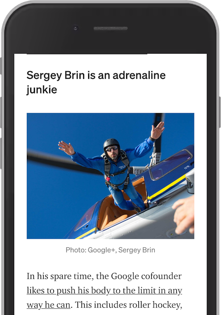
In this screenshot from an article on Medium, there is an image of Google cofounder Sergey Brin, jumping out of a helicopter. An descriptive text for this image would be something like:
"Sergey Brin skydiving from a helicopter"
Product pictures
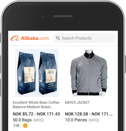
The first product image shows a bag of coffee. When zoomed in, there are a lot of interesting details in the image, like the brand name, the weight and the sustainability badge on the back.
An appropriate alternative text for this image would be:
"Dr. Nam whole bean coffee. Medium roast. 500 grams. UTZ certified"
The second product image shows a jacket. Try to make a brief description like this:
"Kicker Sports men's jacket. Full zipper. Gray arms. Black and white pattern in front. Two pockets with buttons on the sides."
Background images
Background images are often not meaningful. They can be used to set a mood. Sometimes they tell something more than just a mood. Let us try to add a text alternative for what the image is trying to tell us.
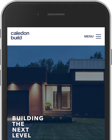
This example from Caledon Build has a background image of a house. Not an ordinary house, but a modern house that this company built. The text Building the next level does not tell the user specific what kind of houses they build. A description of this image should be something like:
Private house, modern architecture with straight lines. Minimalistic with a big garage
Stand-alone icons
Describe the function of the icon, not the presentation.
Articles on Medium have four stand-alone icons below the main heading. Instead of describing the presentation of the icon, like "Twitter logo", we should write what the icon does:
- "Share on Twitter"
- "Share on LinkedIn"
- "Share on Facebook"
- "Bookmark on Medium"
Badges
The previous example has an icon showing a small star. The icon is not interactive, it does not do anything. It means something. It signifies partner stories, readable only by subscribed members. A text description like "Black star" would make no sense. Instead, write the meaning:
"Partner story"

The coffee product has two badges. For these we must add a text of what they represent. The first has the text 1 YR. In this case, this means that the supplier has been a paid supplier member for one year. The second badge is an illustration of two yellow blocks. This icon is for gold suppliers that have a premium membership. These badges should have alternative texts like this:
"Paid supplier for one year"
"Gold supplier"
Logos
Describe the intention of the logo.
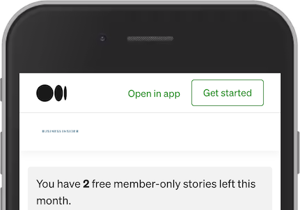
In this screenshot from an article on Medium, we have two logos. First, the main logo from Medium. Second, the logo of this channel, Business Insider. To add "Medium" and "Business Insider" would not be sufficient as descriptive text. The user might not know if the logo is linked to the web site of Business Insider or to the Medium channel for Business Insider. In this case it is the latter, and we can write these descriptions:
- "Medium home"
- "Business Insider on Medium"

