Accessibility Color Contrast
Why
Text and graphical components on a web page need good contrast so that we make sure that it is perceivable for users. Some of us have reduced vision. Others will be in a situation where contrast is important, like out in a bright sunlight.
What
We measure contrast between text or graphics against the background color. This is called contrast ratio. A white text on a white background has a contrast ratio of 1. This is impossible to perceive. Black text on a white background has a contrast ratio of 21.
There is no perfect ratio. It is not always as high as possible, even though a high contrast is usually more readable than a low contrast. According to Apple, we should strive for a minimum of 4.5, although 7 is preferred.
How
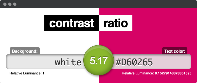
One way to measure the color contrast is to use a tool like Contrast Ratio. This accepts multiple color inputs, like RGB, HSL and hex. It even supports transparency, like RGBA.

Example from Foodora

Foodora uses the color Royal Red as their main profile color. The color has the hex code #D60265. On white, the color contrast is 5.17. This is good for decorations, icons, logo and buttons. If Foodora had used this color for bigger chunks of text, the readability would have been poor.
Text on images
To measure contrast on text on top of a background image, we need to find the brightest or darkest part of the image. If the text is bright, look for the brightest part and vice versa.
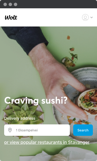
In this example from Wolt, we have white text on a bright background image. Using a color picker on a light green section gives us the hex value #a1ad95. This is a contrast ratio of 2.35. Not sufficient. One possible improvement is to add a color overlay on that part of the picture with text. The overlay can be solid or have a degree of opacity.

Different states
Any interactive component has different states – hover, focus, active, unvisited, visited and deactivated. Remember to ensure that the states also have good contrast. Working with states, we have to think about two scenarios:
- Color contrast needs to be good for all states.
- Change of contrast from unfocused to focused state is at least 3.

In this example from Cos clothing, the navigation has a color contrast of 9.73.

However, hovering Women gives us a hover contrast of 2.84.

