React CSS-in-JS
What is CSS-in-JS?
CSS-in-JS is a styling technique where you can write CSS directly in your JavaScript code.
This approach allows you to:
- Write CSS using JavaScript
- Create component-scoped styles
- Use dynamic styles based on props
- Avoid CSS class name conflicts
In this tutorial, we'll use the popular styled-components library.
Getting Started
CSS-in-JS is not a part of the React core library, but can be installed using many React build tools, like Vite, Webpack, or Create React App.
To install styled-components, run the following command:
npm install styled-components
Now you can start writing CSS directly in your .jsx files:
Example
Insert styles directly in the .jsx files:
import styled from 'styled-components';

const MyHeader = styled.h1`
  padding: 10px 20px;
  background-color: #007bff;
  color: white;
`;

function App() {
  return (
    <>
      <MyHeader>Welcome!</MyHeader>
    </>
  );
}Without CSS-in-JS, you would have to either:
- Write CSS in a separate .css file and import it into your React components
- Use inline styles
Notice that:
- We use the
styledobject to create components - Styles are written inside template literals (backticks)
- You can use regular CSS syntax
Props in Styled Components
Another powerful feature of CSS-in-JS is the ability to use props to make styles dynamic.
Let's create an example where we have two buttons, one primary and one secondary.
We want to base their background color on the value of the btntype prop:
Example
import styled from 'styled-components';

const Button = styled.button`
  padding: 10px 20px;
  border: none;
  border-radius: 4px;
  background-color: ${props => props.btntype === 'primary' ? '#007bff' : '#6c757d'};
  color: white;
  cursor: pointer;
`;

function App() {
  return (
    <div>
      <Button btntype="primary">Primary Button</Button>
      <br />
      <br />
      <Button>Secondary Button</Button>
    </div>
  );
}Extending Styles
Another way of letting multiple elements have the same styles is to extend existing styled components.
For example, we can create a PrimaryButton
and SuccessButton
that both have the same styles as the Button component,
but they also have separate background colors:
Example
import styled from 'styled-components';

const Button = styled.button`
  padding: 10px 20px;
  border: none;
  border-radius: 4px;
  color: white;
  cursor: pointer;
`;

const PrimaryButton = styled(Button)`
  background-color: #007bff;
`;

const SuccessButton = styled(Button)`
  background-color: #28a745;
`;

function App() {
  return (
    <div>
      <PrimaryButton>Primary</PrimaryButton>
      <SuccessButton>Success</SuccessButton>
    </div>
  );
}Component-Scoped Styles
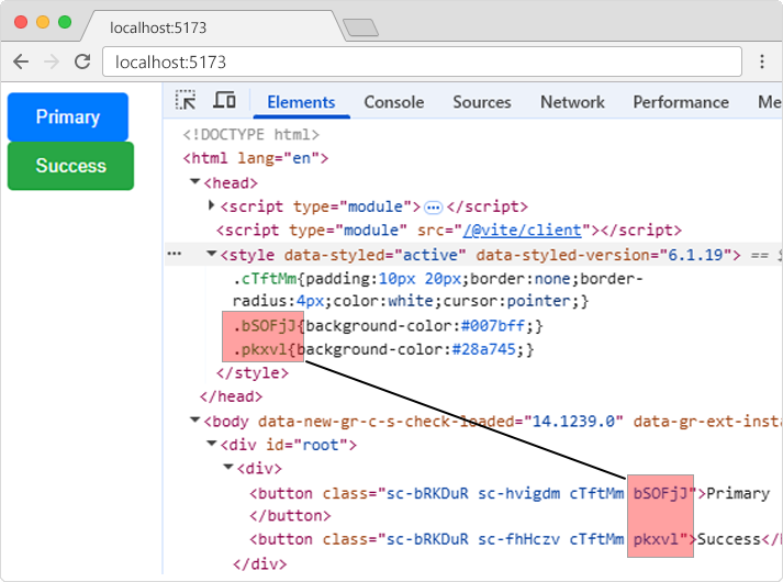
Just like with CSS Modules, styles created in CSS-in-JS are scoped to the component.
They are given unique names and can only be used in the component that imports them.
If we view the source of the page in the example above, the buttons will have unique class names
like bSOFjJ
and pkxvl,
and will be refering to the CSS with the same unique class names in the style section.
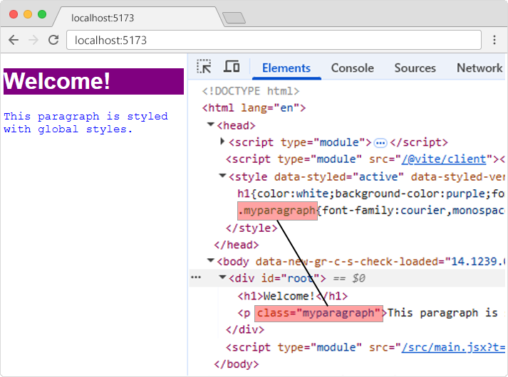
Global Styles
You can also create global styles, which will be given normal class name and will be available for all components:
Example
import { createGlobalStyle } from 'styled-components';

const GlobalStyle = createGlobalStyle`
  h1 {
    color: white;
    background-color: purple;
    font-family: Arial, sans-serif;
  }

  .myparagraph {
    font-family: courier, monospace;
    color: blue;
  }
`;

function App() {
  return (
    <>
      <GlobalStyle />
      <h1>Welcome!</h1>
      <p className="myparagraph">This paragraph is styled with global styles.</p>
    </>
  );
}If we view the source of the result in the example above, the CSS will have normal names and will be available for all components.