
W3.CSS Images
Images
W3.CSS provides classes for styling responsive and attractive images.
Images can have rounded corners, borders, cards, effects, and overlays.
Responsive Images
The w3-image class makes an image responsive.
The image will scale down when necessary, but it will not become larger than its original size.

Note
Responsive images help prevent images from becoming wider than their containers.
Full Width Images
Use width:100% when you want an image to fill the width of its container.
Maximum Image Width
You can combine width:100% with max-width to make an image responsive without letting it become too large.
Example
<img src="img_lights.jpg" alt="Northern Lights"
style="width:100%;max-width:400px">
Try it Yourself »
Rounded Images
The w3-round class adds rounded corners to an image.

Circled Images
The w3-circle class shapes an image into a circle.
Example
<img src="img_snowtops.jpg" class="w3-image w3-circle" alt="Norway"
style="width:250px;height:250px;object-fit:cover">
Try it Yourself »
The object-fit Property
The CSS property object-fit:cover; scales an image to fill its container
while preserving its original aspect ratio.
If the image does not match the aspect ratio of its container, the image is cropped along the edges to prevent
any stretching distortion.
For a perfect circle, the image should have the same width and height.
Bordered Images
Use w3-border to add a border around an image.
Padding can be added to create a thumbnail effect.
Image as a Card
Combine an image with w3-card to create a simple image card.

Simon
The boss of all bosses
Example
<div class="w3-card">
<img src="img_avatar.png" alt="Person" style="width:100%">
<div class="w3-container">
<h3>Simon</h3>
<p>The boss of all bosses</p>
</div>
</div>
Try it Yourself »
Text on an Image
Use w3-display-container and display classes to position content over an image.
Norway
Northern Lights
Example
<div class="w3-display-container w3-text-white">
<img src="img_lights.jpg" alt="Lights" style="width:100%">
<div class="w3-display-bottomleft w3-container">
Norway
</div>
</div>
Try it Yourself »
You learned more about display positioning in the W3.CSS Display chapter.
Image Opacity
The w3-opacity classes make images transparent:

w3-opacity-min
w3-opacity
w3-opacity-max
Example
<img src="image.jpg" class="w3-image w3-opacity-min">
<img src="image.jpg" class="w3-image w3-opacity">
<img src="image.jpg" class="w3-image w3-opacity-max">
Try It Yourself »
Image Hover Effects
Image effects can also be applied when the user moves the mouse over an image.
w3-hover-opacity
w3-hover-grayscale
w3-hover-sepia
Example
<img src="image.jpg" class="w3-image w3-hover-opacity" alt="Norway">
<img src="image.jpg" class="w3-image w3-hover-grayscale" alt="Norway">
<img src="image.jpg" class="w3-image w3-hover-sepia" alt="Norway">
Try it Yourself »
Grayscale Levels
The w3-grayscale classes add a grayscale effect to an image:

Normal
w3-grayscale-min
w3-grayscale
w3-grayscale-max
Example
<img src="image.jpg" class="w3-image w3-grayscale-min">
<img src="image.jpg" class="w3-image w3-grayscale">
<img src="image.jpg" class="w3-image w3-grayscale-max">
Try it Yourself »
Sepia Levels
The w3-sepia classes add a sepia effect to an element.
Normal
w3-sepia-min
w3-sepia
w3-sepia-max
Example
<img src="image.jpg" class="w3-image w3-sepia-min">
<img src="image.jpg" class="w3-image w3-sepia">
<img src="image.jpg" class="w3-image w3-sepia-max">
Try it Yourself »
Hover On/Off
The w3-hover-opacity class adds transparency to the image on mouse-over.
The w3-hover-opacity-off class removes transparency on mouse-over.
Add transparency on hover:
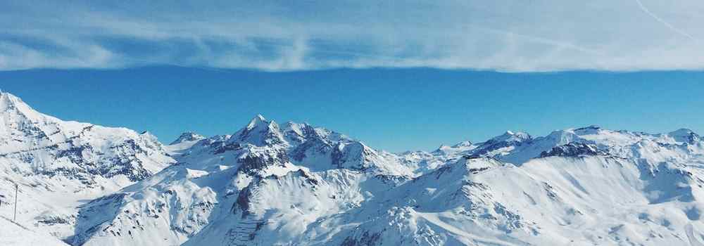
Remove transparency on hover:
Example
<img src="snowtops.jpg" class="w3-hover-opacity" alt="Alps">
<img src="snowtops.jpg" class="w3-opacity w3-hover-opacity-off" alt="Alps">
Try It Yourself »
Photo Album
Images, cards, and the W3.CSS responsive layout classes can be combined to create a photo album.
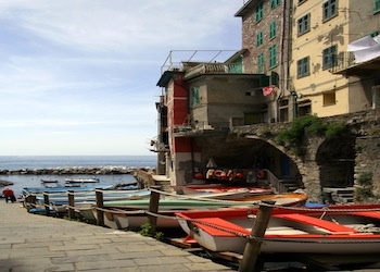
5 Terre
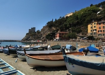
Monterosso
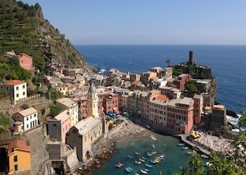
Vernazza
Example
<div class="w3-third">
<div class="w3-card">
<img src="img_monterosso.jpg" style="width:100%">
<div class="w3-container">
<p>Monterosso</p>
</div>
</div>
</div>
Try it Yourself »
Large Hero Images
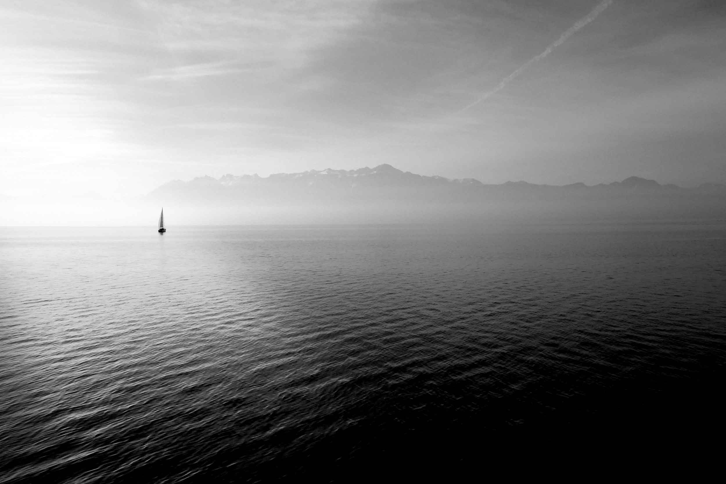
"Hero image" is a term used for a specific type of web banner.
A hero image is a large image, placed in the front of a web page. It often consists of both an image and some text, and it can be static or a rotating list of images.
The purpose of an hero image is to present the web site's most important content.
Brought to you by Captain Hook
Welcome to my Sailing Web
Sailing comprises wind propulsion of a craft by means of sails and steering it over water, ice or land, depending on the type of craft. A sailor manages the force of the wind on the sails by adjusting their angle with respect to the moving sailing craft and sometimes by adjusting the sail area. The force transmitted from the sails is resisted by forces from the hull, keel, and rudder of a sailing craft, by forces from skate runners for an iceboat, and by forces from wheels for a land sailing craft to allow steering a course on a point of sail with respect to the true wind. (Wikipedia)